Machine Learning 1 (K-Nearest Neighbours)
KNN Algorithm Tuning, Grid Search, Cross Validation, Model Evaluation Metrics, Classification Report, Confusion Matrix and ROC Curve.
Topics: \[KNN, Hyperparameter Tuning, Machine Learning, Grid
    Search, Cross Validation, Model Evaluation Metrics, Classification
    Report, Confusion Matrix, ROC Curve\]
Here’s the table of contents:
- 1) Import libraries
- 2) Exploratory Data Analysis (EDA)
- 3) Split and scale data
- 4) Hyperparameter tuning
- 5) Evaluation of optimal model metrics
1) Import libraries
import numpy as np
import pandas as pd
import seaborn as sns
import matplotlib.pyplot as plt
from sklearn.preprocessing import StandardScaler
from sklearn.neighbors import KNeighborsClassifier
from sklearn.model_selection import cross_validate
from sklearn.model_selection import train_test_split
from yellowbrick.classifier import ROCAUC, ConfusionMatrix, ClassificationReport

pd.options.mode.chained_assignment = None
2) Exploratory Data Analysis (EDA)
For the sake of this tutorial, we will not engage in extensive EDA. However, the visualization posts bring very detailed EDA analyses.
2.1) Load File
Original data source: https://archive.ics.uci.edu/ml/machine-learning-databases/wine-quality/
data = pd.read_csv('https://raw.githubusercontent.com/leonardodecastro/data/main/winequality-white.csv')
2.2) Create a definition for Good Wine
data['Good Wine?'] = np.where(data['quality'] < 7, 0, 1)
2.3) Drop original quality feature
data.drop('quality', axis=1, inplace = True)
3) Split and scale data
Since we will use cross validation, there is not need for a validation set.
3.1) Split the data frame into the training, validation and test sets
# This line will disappear in the portfolio page
# Determine X and y
X = data.drop('Good Wine?', axis = 1)
y = data['Good Wine?']

# Split dataset (use the argument stratify to make sure we keep a reasonable number of both classes in the training and test sets)
X_train, X_test, y_train, y_test = train_test_split(X, y, test_size=0.3, random_state=42, stratify = y)
3.2) Scale the dataset
# This line will disappear in the portfolio page
# Select a type of scaler
scaler = StandardScaler()

# Apply fit_transform on the training set and apply it to the test set
X_train_scaled = scaler.fit_transform(X_train)
X_test_scaled = scaler.transform(X_test)
4) Hyperparameter tuning
4.1) Calculate a wide range of metrics for model evaluation
# This line will disappear in the portfolio page
# Step 1: Create a dictionary to store the metrics for different k values
scores_dict = {}

# Step 2: Train model for different k values (number of neighbours)
for k in range(1, 200):
  # Part 1: Select classifier object
  knn = KNeighborsClassifier(n_neighbors=k)
  # Part 2: Determine the metrics that will be analyzed
  scoring = {'accuracy': 'accuracy', 'precision': 'precision', 'recall': 'recall', 'f1': 'f1'}
  # Part 3: Calculate metrics using cross-validation
  scores = cross_validate(knn, X_train_scaled, y_train, cv=5, scoring=scoring)
  # Part 4: Extract the mean of each one of the metrics
  scores_dict[k] = {'accuracy': scores['test_accuracy'].mean(), 'precision': scores['test_precision'].mean(),
                    'recall': scores['test_recall'].mean(), 'f1': scores['test_f1'].mean()}

# Step 3: Create a dataframe with model metrics
metrics_df = pd.DataFrame.from_dict(scores_dict, orient='index').rename_axis('K').reset_index()
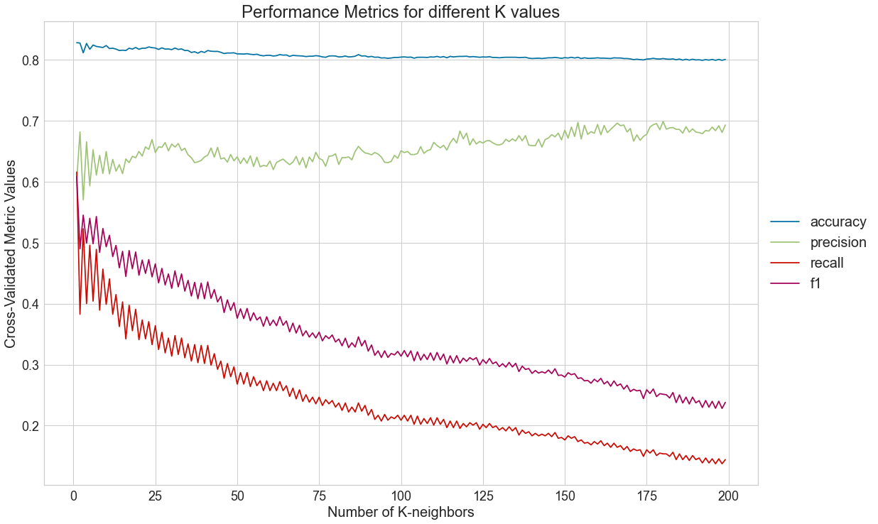
4.2) Plot metrics for different k values
# This line will disappear in the portfolio page
# Step 1: Melt the dataframe to allow for an easy way to plot with seaborn
metrics_df_melted = pd.melt(metrics_df, id_vars =['K'], value_vars =['accuracy', 'precision','recall', 'f1'])

# Step 1: Set parameters for the visualization
plt.rcParams.update({'figure.figsize':(20,7),'axes.titlesize': 20,'axes.labelsize': 16,'xtick.labelsize': 14,'ytick.labelsize': 14})

# Step 2: Generate visualization
sns.lineplot(x="K", y="value", hue="variable", data=metrics_df_melted)
plt.title("Performance Metrics for different K values")
plt.ylabel('Cross-Validated Metric Values')
plt.xlabel('Number of K-neighbors')
plt.legend(bbox_to_anchor=(1, 0.5), loc="center left", fontsize=16)
plt.show()

4.3) Determine number of neighbors that optimizes precision
For the sake of this analysis, we will consider that the company at hand is a website that provides wine recommendations. Thus, the cost of recommending a bad wine is very high. This means that this firm will seek to maximize precision.
ideal_number_neighbours = metrics_df.sort_values('precision', ascending = False)['K'].to_list()[0]
5) Evaluation of optimal model metrics
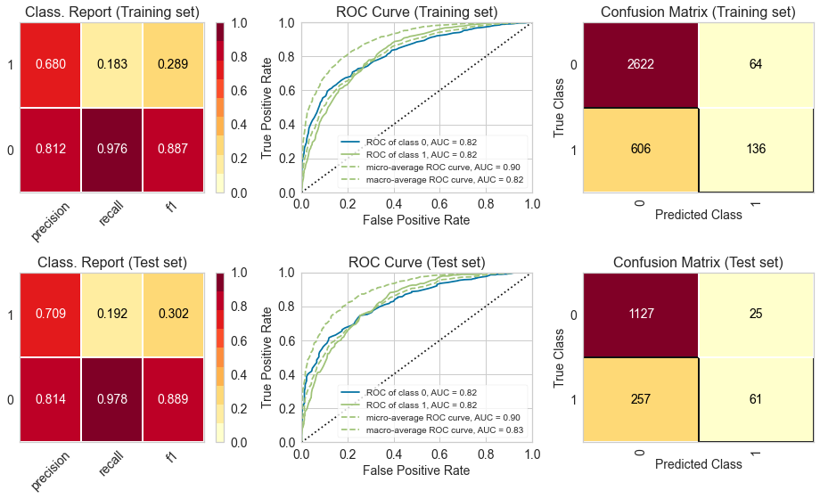
5.1) Classification Report, ROC Curve and Confusion Matrix
# This line will disappear in the portfolio page
# Step 1: Set the size of the figure
plt.rcParams.update({'font.size': 14,'axes.titlesize': 16,'axes.labelsize': 14,'xtick.labelsize': 14,'ytick.labelsize': 14})
fig, axes = plt.subplots(2,3, figsize=(13, 8))

# Step 2: Select the classifier
model = KNeighborsClassifier(n_neighbors=ideal_number_neighbours)

# Step 3: Create lists with the visualizers
visualizers_list_training = [ClassificationReport(model, classes=[0, 1], ax=axes[0,0], title = "Class. Report (Training set)"),
                    ROCAUC(model, classes=[0, 1], ax=axes[0,1], title = "ROC Curve (Training set)"),
                    ConfusionMatrix(model, classes=[0, 1], ax=axes[0,2], title = "Confusion Matrix (Training set)")]

visualizers_list_test = [ClassificationReport(model, classes=[0, 1], ax=axes[1,0], title = "Class. Report (Test set)"),
                    ROCAUC(model, classes=[0, 1], ax=axes[1,1], title = "ROC Curve (Test set)"),
                    ConfusionMatrix(model, classes=[0, 1], ax=axes[1,2], title = "Confusion Matrix (Test set)")]

# Step 4: Generate visualizations for the training set
for visualizer in visualizers_list_training:
  visualizer.fit(X_train_scaled, y_train)                                # Fit the training data to the visualizer
  visualizer.score(X_train_scaled, y_train)                              # Evaluate the model on the training data
  visualizer.finalize()

# Step 5: Generate visualizations for the test set
for visualizer in visualizers_list_test:
  visualizer.fit(X_train_scaled, y_train)                                # Fit the training data to the visualizer
  visualizer.score(X_test_scaled, y_test)                              # Evaluate the model on the test data
  visualizer.finalize()

We can see that the metrics for the training and test set are fairly similar, which indicates that there is no problem with overfitting or underfitting. Moreover, the ROC curve indicates that the classifier outperforms a random classifier (the baseline). :::